Building a brand for a cycling destination is not the same as designing a logo. It means asking a more difficult question first: what does this place actually feel like? What is its character? What would it say if it could speak?
The South Garda Bike Region brand was built by starting there — with the territory itself — and working outward. The result is a visual identity where every element has a reason, and that reason is always the same: this is what this place is.
The brand identity was designed by Carolina Diana Rossi — cadiro.studio.
Starting from the landscape
The morainic hills south of Lake Garda are not dramatic. They do not demand attention. They are soft, rolling, layered — the kind of landscape that reveals itself gradually as you move through it, that gets better the more slowly you go.
That quality shaped every design decision. The brand was not built around performance or speed or spectacle. It was built around discovery, authenticity and the particular pleasure of a landscape that rewards patience.
From the beginning, the goal was an identity that felt young and international without losing its roots — something a cyclist from Germany or the Netherlands would recognise as contemporary and credible, while still feeling genuinely local to someone from Castelnuovo del Garda.
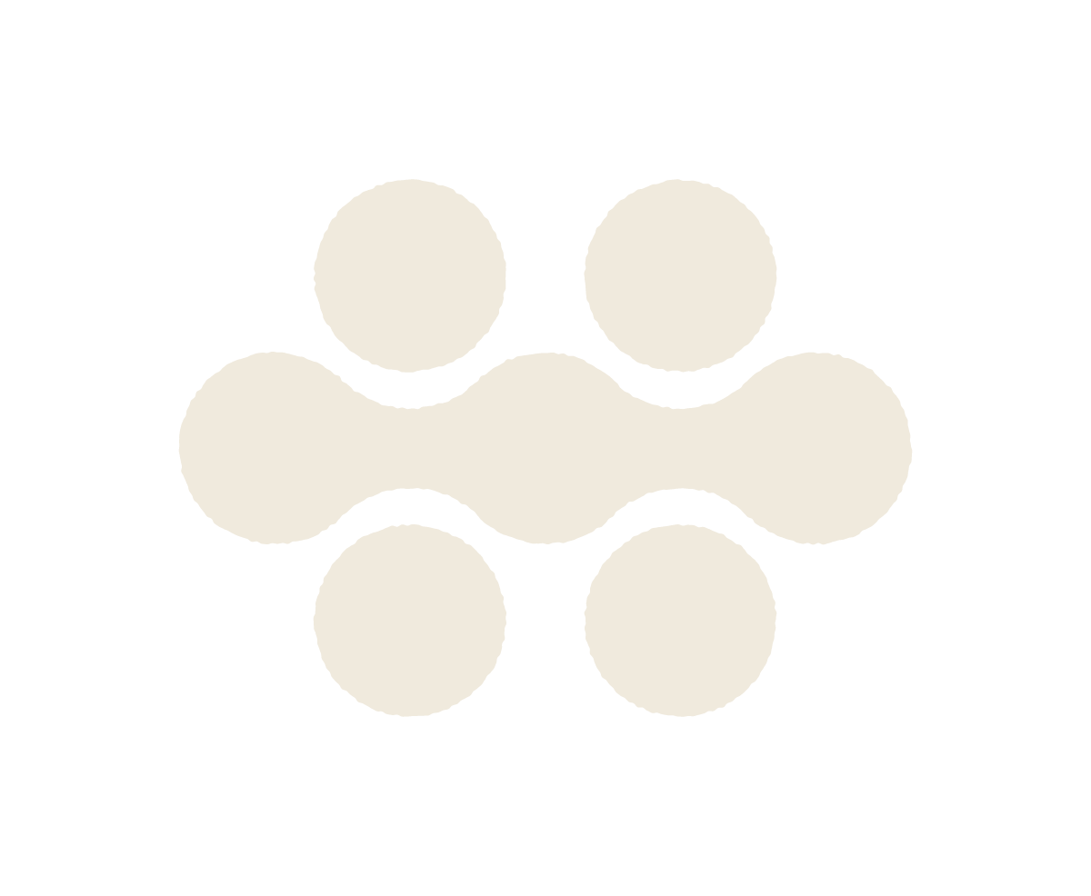
The logo — two things at once
The logo is built from a series of linked circular forms that sit deliberately between two readings.
The first reading is the bicycle chain — the most essential mechanical element of cycling, the part that translates human effort into forward movement. It is a direct, honest reference to the world the brand lives in.
The second reading is the profile of the morainic hills — those rounded ridges that define the skyline of the South Garda landscape, shaped by glaciers over thousands of years. From above, from a distance, from the saddle of a bike on a climb, the hills have exactly this quality: soft, connected, rhythmic.
The two images exist simultaneously in the same shape. You cannot separate them, because they are not meant to be separate. The bike and the landscape are the same thing here — that is the whole point
The colour palette — a map of the territory
Each colour in the South Garda Bike Region palette was chosen to represent something specific and real about the landscape. Together they build a picture of a place before you have even seen a photograph.
- Verde Collina — the green of the hills in summer, the vineyards, the hedgerows along the country lanes. A colour that says this is a living, working, agricultural landscape.
- Celeste Lago — the blue of the lake on a clear morning, glimpsed at the end of a descent through a gap in the trees. A colour that orients you, that tells you the water is close.
- Marrone Gravel — the brown of the dirt tracks and morainic earth, the colour of a gravel road after rain. The most cycling colour in the palette, the one that sits at the heart of the identity.
- Sabbia Beige — the pale gold of the strade bianche, the white gravel roads that are one of the signature surfaces of this part of Italy. Light, open, unhurried.
- Giallo Sole — the warm yellow of late afternoon sunlight on the vines, the colour of welcome and warmth and a day that has gone well.
- Rosé — a direct reference to the local wine culture, the colour of a glass of Bardolino on a terrace at the end of a long ride. A reminder that the best rides always end with something worth savouring.
The palette works as a whole because it tells a coherent story. Every colour is from the same territory, the same season, the same experience of being here. Nothing is arbitrary.
A mark that lives on the territory
The brand is not only digital. It is physically present in the landscape — displayed by local wineries, accommodation, cafés and businesses that are part of the South Garda Bike Region partner network.
When a cyclist sees the logo on a window or a roadside sign, it communicates something immediate and practical: you are welcome here, there is space for your bike, the people inside understand why you ride. The mark becomes a signal between the territory and the people moving through it.
That is the final function of any strong brand identity — not decoration, but communication. Not aesthetics for their own sake, but a visual language precise enough to carry real meaning across every surface it lands on.
South Garda Bike Region is a young brand. But it was built to last — rooted deeply enough in the character of its territory that it will still make sense ten years from now, when the routes have grown and the community around them has grown with them.